How can you make Donation Pages effective
The State of Donation Pages report tells you how to make them effective
40% of nonprofits require non-essential information to complete a donation, 55% had distracting 7 Key Findings from Giving to 203 Nonprofits 5 links on their page, and 30% had 3 or more steps to complete a donation. These are all contributing factors to donors abandoning their gifts.
Majority of donors freak out when you ask for phone numbers during the time of donations. The maximum dropouts happen during this process. In fact, one of the common questions that I have come across during my fundraising campaign is “Why do you need so much data or information or can’t I have the ability to donate anonymously.”
Indians have a love and hate relationship when it comes to data and privacy. The country that is yet to have a Personal Data Protection Bill; believes that privacy is paramount, with nearly four out of five consumers (81 percent) saying they are very cautious about the privacy of their personal data.
However, seven in ten consumers in India would be willing to share significant personal information, such as location data and lifestyle information, with their bank and insurer in exchange for lower pricing on products and services, according to a new report from Accenture.
The findings of donations and the problems associated with it are part of an excellent report done by NextAfter Institute - “The State of Donation Pages.” The report is based on the online giving experience from 203 Nonprofits organizations.
Your donation page is the backbone of your online fundraising. Starting from “Why should I give to you”, the trust factor, security of data, and experience everything comes to play right here on this one page. How you remove the online donation hindrances and provide a secure and comfortable experience is the differentiator.
“We often say that fundraisers are from Mars and donors are from Venus. You, fundraisers and marketers, look at giving from very different perspectives. You look at a donation page and think, “Give us money,” because it’s a way to collect donations. It’s a processing tool. And while it’s true that your donation page is an ultra-efficient means to collect money and information, when donors see a donation page they don’t think the same way. They think of your donation page as a way for them to live out their values and to make an impact,” says the report.
So how can you make the donation pages more effective and thereby making the donation process seamless? Ask yourself these below questions or better remove the barriers from the donation pages.
Can donors easily find where to give?
78% of nonprofits use “donate” language for their button, as opposed to “give” or “support” language. This could make it easier for donors to understand where to give. However, Food for Hunger uses “Sponsor a child” button. Again it also depends on in which geography the organization and what word is more familiar to the target audience.
But make sure that the donate button is easily accessible for the donor both on the web and mobile. Don’t hide it. The goal here is to address the visitor’s or potential donor’s motivation.
This is a traffic-focused strategy. People are looking to make a donation. Just by making it easier to find and to access, Nonprofits can multiply their donations.
If you are also focussing on recurring donations then make sure that you have a different button or call to action. Just don’t confuse the donor. Only 17% had a different recurring button, so the majority of the NGOs are finding difficult to give a strong value proposition around recurring giving. Just adding multiple options of giving will not motivate people to be a recurring donor.
I pay a monthly subscription for Netflix and Amazon Prime because both serve my entertainment hunger. What is your NGO doing for me? You just can’t motivate people to be a recurring donor on humanitarian grounds.
Why should I give it to you or not at all?
This is the most basic question that comes to mind before even you think of donating. Just like any other business, a Nonprofit organization has to be very cleary with the “Why” or the value proposition. And are you communicating it seamlessly across all platforms and in every communication?
When it comes to communicating value, you need to answer a question in the mind of the donor: If I am your ideal donor, why should I give to you rather than some other organization or not at all? This is the value proposition question that all donors have in their mind, and that you need to be answering throughout your giving process.
There are four main ways you can answer this question.
Do they want what you are offering? (Desire)
Can they get it anywhere else? (Exclusivity)
Do they understand what you do? (Clarity)
Do they believe you? (Credibility)
Only 33% or nonprofits had a strong value proposition. In other words 67% had an average or weak value proposition.
How do you improve: one of the simple ways is by adding more copy or text on your donation pages that clearly explain why their donation is needed and what their donation will do. Try turning “we” or “us” language to be “you” or “your” language.
Another finding from the report was adding a second call to action headline that says what their donation will do right before the form. Maybe even tell them what to do by saying, “Complete the form.”
Removing friction
40% of organizations required non-essential information to complete a donation. This means they required information other than what was really needed to process the gift. This could be a phone number, a title, CAPTCHA, or a question about how you found out about them. The most required non-essential information was a phone number (25%).
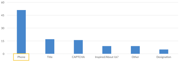
If you’re going to require a phone number, you have to make sure you make up the value somewhere else in the process in terms of upgrades or thank yous. This creates a lot of friction and anxiety in the process.
The report has listed seven types of friction that leads to abandonment.
Confusions or distractions are one more common form of friction. The majority (55%) of donation pages had menu and navigation distractions. If someone’s trying to donate and all of a sudden they see events and policies that could impact them, they might find those more interesting, choose to go there instead, and abandon the donation form.
For example take a look at the below screengrab. The second image has nothing else to do on the page other than complete this donation. They also include some trust marks.
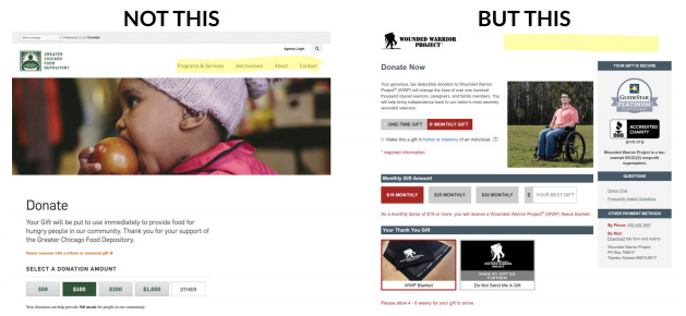
38% of organizations had multiple calls to action on the donation page. These might be asking someone to sign up for a newsletter or to give in a different way. The donation page should have just one focussed objective of making the donation happen at ease. The donor is already going through multiple levels of decision making in his mind. Just don’t increase the number by your marketing greed.
Device friction is another common friction. The discussion is not about whether you should have a mobile optimised donation page but it is about the difference between the desktop experience and the mobile experience. Both devices are different and that means you will have a different layout. But that does not mean you give up the value proposition on mobile, just because people tend to have a belief that mobile is for a quick experience. For reference see the below image:
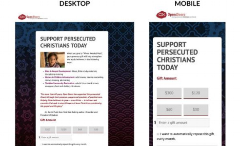
14% of nonprofits in this study removed their value proposition from mobile. You might think people just want a quick mobile experience, and so it makes sense to limit the information provided on the mobile page, but the value proposition — the reason to give — is essential.
Reducing anxiety
Why should a donor trust you? This has to do with anxiety, and donors want to know the answers to two main questions:
Is my information secure?
Am I making a good decision?
Try showing donors their credit card information is secure when it matters most. 42% of organizations were using third-party endorsements. Try adding trust marks within the eyesight of the donor. Don’t bury them deep in the footer where no one will see them. Make sure they are at least within the eyesight of the donor while they’re making the donation.
Additionally, have a link to your privacy policy and try to reinforce your message below the donate button.
Do you have a thank you page?
And finally are you taking the effort to say thank you to the donor? Is it just an automated generic thank you that speaks clearly that the Nonprofit is very lazy and all it wants is your money.
95% of nonprofits had a confirmation page, and 97% of nonprofits thanked the donor. But some didn’t say very much or lead us forward after the donation. They said something like, “Thank you for giving with us,” or “You are a partner in our work.” That’s it. 36% didn’t note the gift amount, and 46% didn’t have any value or impact-oriented language.
Here is an example of a thank you page:
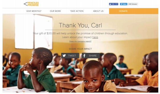
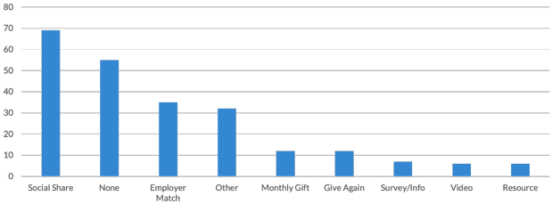
Good donation pages should facilitate a good conversation. The most popular is having Social Share buttons. Milaap has Facebook and Whatsapp. The crowdfunding organization has messaging integrated with Whatsapp and it also believes both these platforms drive more engagement for the platform. Social sharing is also the most preferred choice by organizations. But at the same time 55 organizations offered no next action. This is a lost opportunity.
Some Nonprofit organizations are using the thank you page as a mode of a survey. The idea is to collect user information on the process and experience. This is an untapped feature; people want to be heard so it can be a great exercise on getting user feedback.
Reinforce the impact of their gift and your value proposition. Suggest a next action that makes sense, and ideally, relates to the donation they just made
Removing these common barriers will not increase your donations but it will make your Donation Pages far more effective thereby reducing dropouts.
But is it enough to answer the question Why should I give to you?
To be continued…
P.S. Did the article give value to your time? If yes then can you donate to my ongoing fundraising campaign for COVID-19. Donation Link. If no then I will try harder next time. Thank You!

